Company philosophy and Graphic identity
We are a company committed to natural organic cosmetics and sustainable, fair trade commerce. Our uniqueness lies in the combination of deep respect for the environment and an ethical, inclusive production model. Every stage of production is carefully carried out by rural communities in Africa, primarily composed of women who receive fair wages and dignified working conditions. This approach not only ensures high-quality products but also promotes empowerment and economic development within local communities.
Packaging design
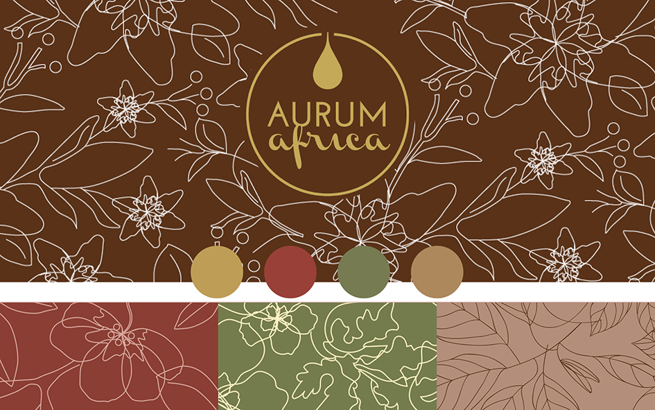
The packaging design is rooted in these core values, reflecting the natural essence, sustainability, and excellence that define AURUM Africa products. The primary inspiration comes from organic African oils—true “liquid gold” with extraordinary organoleptic properties. These oils, symbols of wealth and purity, are at the heart of our brand’s offering and represent its very essence.
From the very beginning, our Creative Director, Maria Cristina Serafini, has been guided by the colors and atmospheres of Africa, capturing the depth and warmth of the continent.
“The deep red of African sunsets, the rich brown of the earth, the soft beige of desert sands, and the vibrant green of untouched nature blend harmoniously with gold, symbolizing the preciousness and uniqueness of AURUM Africa products. This color palette was designed to evoke an ancestral and visceral connection to African landscapes and culture, conveying authenticity and prestige.” – Maria Cristina Serafini, Graphic Design
Going back to the origins, even the company logo was the result of an in-depth study aimed at visually and evocatively telling the story and values of AURUM Africa.
“The logo features a golden drop, symbolizing the precious oil, enclosed within a golden circle. The circle represents the cyclical nature of the production process—from harvesting seeds from naturally growing trees to the sustainable processing that creates AURUM Africa oils.” – Maria Cristina Serafini, Graphic Design
Finally, the typographic choices reflect the duality and cultural richness of the African continent.
“The combination of a geometric, modern, and minimalist sans-serif font with a fluid and organic script symbolically represents the different souls of Africa: the dynamic, contemporary side in constant evolution and the traditional side, deeply rooted in history and culture.” – Maria Cristina Serafini, Graphic Design
Branding
In every aspect of its branding, AURUM Africa powerfully and authentically communicates its commitment to a more sustainable future while celebrating the beauty and value that only African nature can offer.